Button Guide
Here you can find a guide on how to construct a button for OSdatascanner anno Jan'24.
When to use <button> VS. <a>
- Use
<button>when the button should:- Submit a form.
- Trigger one or more JavaScript functions.
- Toggle or interact with objects on the same page (e.g., open a modal or a dropdown menu).
- Use
<a>when the button should:- Serve as a navigation UI to another page.
- Link to a different place on the same page.
- Start a download or link to files (e.g., PDFs).
A good rule of thumb for using
<a>tags for UI objects:Is it a link to anything? > No? > Use
<button>instead.
Required attributes
| HTML Tag | Attribute | Reason |
|---|---|---|
| any | class |
Styling - All buttons should have at least the button class. |
| any | aria-label |
Accessibility - This text is read aloud by screenreaders. |
| any | title |
Toolhint - Displays on hover to elaborate on function. |
<button> |
type |
Functionality - Defines button behavior in forms and prevents unintended actions. |
<a> |
href |
Navigation - Specifies the destination URL for the link. |
Semantic structure
To ensure all required attributes are included, list them first. This is especially helpful for those less familiar with your code, as it prioritizes the element's purpose (type/href).
<button type="button"
        class="button button--outline-button button--icon-text-button"
        aria-label="descriptive text that makes sense for a user with visual impairment"
        title="text that elaborates on function (i.e. toolhint)"
        <!-- other attributes -->
        >
    <span>your button text</span>
    <i id="icon_name" class="material-icons">icon_name</i>
</button>
<a href="../relative_path/to_whereever/this_should/link_to/"
   class="button button--outline-button button--icon-text-button"
   aria-label="descriptive text that makes sense for a user with visual impairment"
   title="text that elaborates on function (i.e. toolhint)"
   <!-- other attributes -->
   >
    <span>your button text</span>
    <i id="icon_name" class="material-icons">icon_name</i>
</a>
These blocks render identically in a browser; the only difference is their functionality.
Additionally, wrapping text strings with <span> tags or similar is considered good practice:
It is benificial for targeted styling and JavaScript interaction, improving accessibility by allowing screen readers to interpret text more effectively, and ensuring maintainability and modularity in web development.
This practice enables precise styling adjustments and script interactions for specific text segments without affecting the entire element, thereby enhancing both the functionality and the accessibility of web content.
Button styling - a developer guide
All button style classes follow the BEM (Block, Element, Modifier) naming convention for easy identification and navigation within unfamiliar code.
Intro to _buttons.SCSS
The document accommodates all current styling types used in OSdatascanner. It includes content-based style classes (like icon, icon+text, and text) which handle box-model related styles e.g., for buttons nested inside table cells.
Button design reference
The table below serves as a quick reference guide for UI development when working without a mock-up, providing key insights on button types, their visual weight, and appropriate use cases.
| Design Label | Type | Visual weight | Use case |
|---|---|---|---|
| N/A | Standard | Moderate/low | Neutral - For actions, that are neither urgent nor secondary. |
| Primary | CTA | High | "Call to Action" - Draws attention and prompts user to take an important action. |
| Secondary | Outline | Moderate | For less prominent actions, that are secondary but still necessary. |
| N/A | Transparent | Low | When the button needs to blend with the background or for a minimalistic design approach. |
| N/A | Rounded | Variable | For a friendly and approachable interface. Suitable for both primary and secondary actions, depending on size, color, and placement. |
Class list
Here's an overview of class combinations and their use cases:
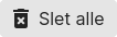
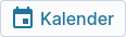
| UI Appearance | Type | Classes |
|---|---|---|
 |
Standard | button |
 |
CTA | button button--cta-button |
 |
Outline | button button--outline-button |
 |
Transparent | button button--transparent-button |
  |
Caret/expand | button button--caret-button {% if order_by == 'scan_status' and order == 'descending' %} up {% endif %} |
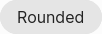 |
Rounded | button button--rounded-button |
  |
Standard | Icon | button button--icon-button |
 |
Standard | Icon+text | button button--icon-text-button |
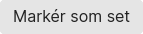 |
Standard | Text | button button--text-button |
 |
cta | Icon+text | button button--cta-button button--icon-text-button |
 |
Outline | Icon | button button--outline-button button--icon-button |
 |
Outline | Icon+text | button button--outline-button button--icon-text-button |
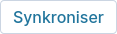 |
Outline | Text | button button--outline-button button--text-button |
Multiple buttons in same UI block
Place them inside a <div> container (if they're not already) and give it the class button-group like so:
<div class="button-group other_class">
    <a href="#action1"
       class="button button--icon-button"
       aria-label="descriptive text"
       title="toolhint"
       <!-- other attributes -->
       >
        <i id="icon_name" class="material-icons">icon_name</i>
    </a>
    <button type="button"
            class="button button--icon-button"
            aria-label="descriptive text"
            title="toolhint"
            <!-- other attributes -->
            >
        <i id="icon_name" class="material-icons">icon_name</i>
    </button>

    <!-- Additional buttons can be added similarly -->

</div>
This arrangement handles the relative layout of multiple button-related objects and suits most use cases for button groups in OSdatascanner.